
Object Toolbar
The Builder's smart toolbar automatically adjusts based on the content type, only showing you the relevant tools for each media type. For complex features, a secondary smart toolbar will appear when there is a subset of tools. Standard icons are used to identify each tool, but if you’re not sure about functionality, tooltips describing each are available by hovering on the button.
Text
By hovering your mouse over any text box a small toolbar will appear on the upper right hand corner of the box, allowing you to edit, add padding, or change the background color of this textbox.
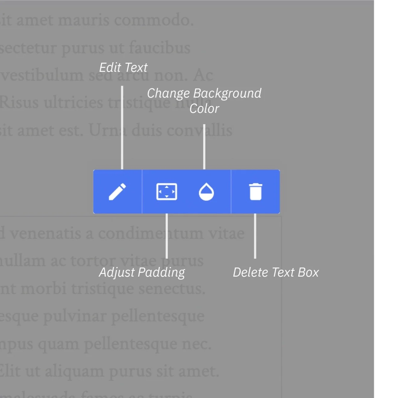
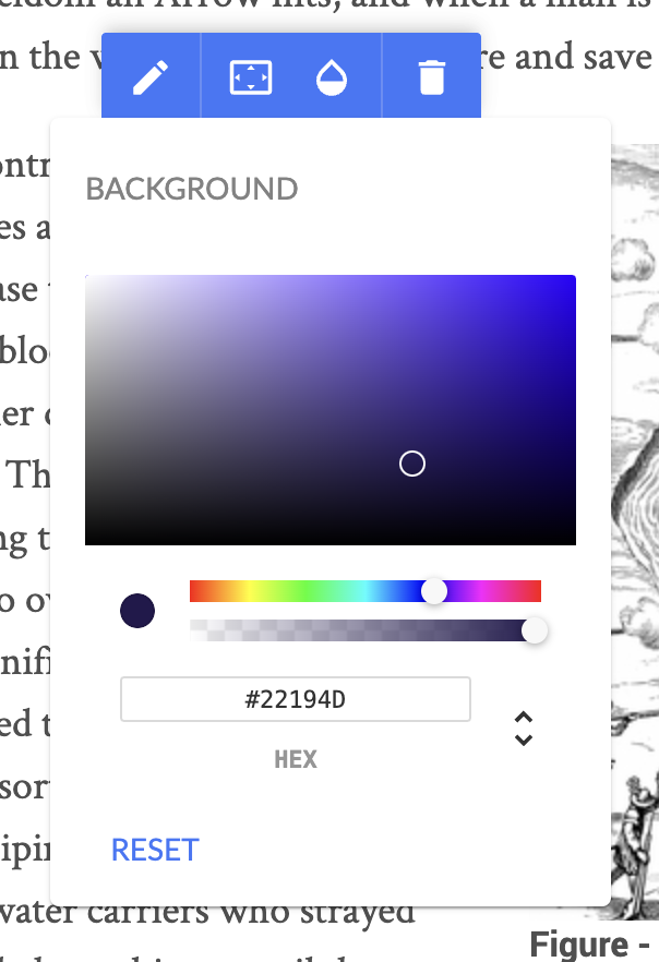
Background brings you to an RGB color picker and allows you to select a color for the background of the text box. You can use the visual interface to drag values for hue, saturation, alpha, and opacity. Or you can toggle the menu below to select colors a different way - via hexadecimal, RGB-A, or HSL-A.
Padding adds a buffer space between the content and the figure’s bounding box.
Edit brings up a variety of options to directly manipulate your text on your page, this is explored in another video here.
Media
By hovering your mouse over an image on your page a similar yet distinct set of tools will appear above the media box.

Background and padding work identically as they would in the text setting, controlling the background color and padding (between the media content and its bounding box), respectively.
Info Toggles designate the metadata that will be shared alongside the item. For media items, you can toggle the title and caption for the asset.
Duplicate will make an additional copy of the media item in the page, which you can then drag/position accordingly.
Crop/Position
Crop/Position brings up a new subset of tools that are designed to help you format the display of the media item in the page - be it an image itself or the cover image for an asset like a video. Please note that this does not alter or edit the file itself, just the display within the page; when any reader clicks on the asset, the full contents will be displayed. Thus, this feature is useful not only to perfect page layout/formatting, but also to zoom or focus on a portion of an image while having the entirely of the image available to the reader.

Upload allows you to switch out the media item. This will assume all of the labels and properties of the old media item, so if you want to add additional media, standard practice is to do it through the media library.
Cover will automatically scale the image so that the entire figure box is filled. In the likely event that the figure box and image are not the same proportional size, that means that either the sides or top/bottom of the original image will be cut off.
Contain is the inverse of the “cover” function; the image is automatically scaled so that its entire extents fit within the figure box. In the likely event that the figure box and image are not the same size, there will be additonal space on either the sides or top/bottom of the image.
Zoom in and Zoom out allow you to scale the image in or out, respectively. This allows you to focus on particular parts of the media item.
Center aligns the center of the media item with the center or the figure box, regardless of the the zoom level.